Commercial Interior Design That Holds Up
Good commercial interior design is judged by the people who spend eight to ten hours a day using the designed space. The desk, the places you go when you leave it, a plan drawn around the actual work, and the air, light and noise nobody quotes for.
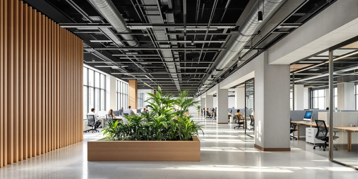
Most commercial spaces in Hyderabad are handed over as a rectangle of concrete with a services soffit overhead, a lift core at one end and a glazed wall along one side. What happens next usually gets judged on the day the photographs are taken, when the space is empty, clean and nobody has worked in it yet.
That is the wrong test. The real one comes at four in the afternoon, in the eighth hour, when somebody has been in the same chair since morning with a screen in front of them and a meeting in twenty minutes. Commercial interior design either makes that hour easier or it does not, and almost nothing about the finishes decides which.
What Does Good Commercial Interior Design Involve?
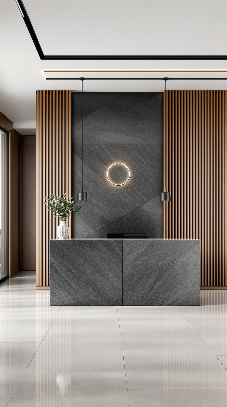
Good commercial interior design is judged by the people who spend eight to ten hours a day using the space. It gets the desk right first, because that is where most of those hours go. It gives people somewhere to move to when they leave the desk, close enough that they actually go. It draws the plan around the work a business really does. And it settles the air, the light and the noise, which quietly decide whether a long day is tolerable.
Everything else, the arrival, the materials, the theme, works in service of those four. A space can be beautiful and still be exhausting to sit in.
The Desk You Sit At All Day

Start where the hours are actually spent. Most commercial interior design conversations begin at the reception and work inward, which is backwards. The reception is somewhere people pass through for ninety seconds. The desk is where they stay.
The decision that matters most is where the screen sits in relation to the window. A bright window directly behind a screen makes the eye fight a difference in brightness all day. A window facing the screen throws reflections across it. Desks running parallel to the glazing, with daylight arriving across the work, solve both at once. It costs nothing at planning stage and is close to unfixable afterwards.
Then the things people notice only when they are wrong. Desk height around 720 to 750mm suits most adults, with a chair that genuinely adjusts. Plenty claim to. Enough depth that a screen sits an arm's length away. Power and data within reach of where a laptop actually lands, so the day does not involve a cable stretched across the desk. Task light at the desk itself, because a ceiling grid alone leaves the work surface dimmer than the room around it.
What someone looks at when they glance up matters more than it sounds. Something with depth, a planted edge, a window, a long view down the floor, rests the eyes in a way a partition at nose height never will. Twenty seconds of looking at something far away is the cheapest thing a workspace can offer, and a plan that faces everyone into a wall removes it entirely.
A commercial interior decorator who asks how the work happens before drawing anything produces a different floor to one who starts from a seat count.
Where You Go When You Are Not At Your Desk

Nobody sits still for eight hours. People take calls, wait for coffee, need to concentrate without being interrupted, and need to stop looking at a screen. Whether those things happen well is a design question.
Proximity governs all of it. A quiet room, a phone booth or a place to sit gets used when reaching it requires no decision, which in practice means it is visible from the desk. Put the same facility at the far end of a floor, behind a door, and it stands empty while people take calls in the stairwell.
A phone booth has to be genuinely private and genuinely available. One booth for forty people is decoration. Two or three small ones, unbookable and near the desks, get used constantly. The same logic applies to a quiet room. If it needs a calendar invite it has become a meeting room, and the person who wanted twenty minutes of concentration will not book it.
The pantry deserves more thought than it usually gets, because it is the one place people go without a task. Somewhere to stand that is not a corridor, a surface wide enough for two people to make coffee at the same time, and daylight if the plan can find any. In many offices it is the only room where people from different teams actually meet, which is worth designing for, and most offices find out by accident.
A Floor Drawn Around How The Business Actually Works

Most floor plans are drawn from a headcount and a template. The result fits everyone and suits nobody, and it shows up first in the meeting rooms.
Watch how meetings really happen and the numbers are consistently smaller than the rooms built for them. Most conversations involve two or three people. Most meeting rooms seat eight, get booked by a pair, and sit locked while somebody else needs a table. Several small enclosed rooms and one genuinely large one will usually serve a business better than three identical middling ones, and that swap releases floor area which had been sitting empty behind glass.
The balance between focus and collaboration differs sharply by what a business does. A team writing software needs long uninterrupted stretches and benefits from lower density and more enclosure. A sales floor runs on overhearing each other. Applying one plan to both is how a workspace ends up fighting the people in it. A commercial interior decorator who asks how the work happens before drawing anything produces a different floor to one who starts from a seat count.
Circulation is the quiet one. Routes that pass behind seated people, and width enough that two people passing does not require anyone to move, are the sort of thing nobody praises and everybody feels.
Air, Light and Noise

These three decide more about a working day than any finish, and none of them appear as a line on a quote.
Air first. A deep floor plate cooled to a drawing rather than to real occupancy turns stuffy by mid-afternoon in exactly the spots furthest from a diffuser, and Hyderabad summers are unforgiving about it. Fresh air matters as much as cooling. Rooms that fill up, meeting rooms and phone booths especially, need their own provision or they become unpleasant within twenty minutes of a door closing.
Light second. Glare is the complaint people rarely make in those words. They say the screen is hard to read, or they close the blinds at eleven and leave them shut for the rest of the year, throwing away the daylight the space was leased for. Shading that cuts the harsh angle while keeping the view, and artificial light that stays even, prevents both.
Noise last, and most underestimated. An open floor of hard surfaces turns every phone call into everybody's phone call. Soft finishes where they can go, an acoustic raft over the densest desks, carpet under the seating, and enclosed rooms placed so the loudest activity is not beside the quietest, are what make an open plan workable. Fixing acoustics after handover means undoing finished work.
The Same Four Questions in a Cafe, a Showroom, a Clinic or a Salon


The four questions hold everywhere. The answers change, because the person spending eight to ten hours in that room is doing something different.
A cafe counter is the desk, and it gets worked standing up for a whole shift. Height, reach and floor comfort matter the way chair adjustment does in an office, and the route from machine to till to pass gets walked hundreds of times a day. The equivalent of a breakout is a back-of-house where staff can step out of sight for a minute. Noise runs the other way here, because a room that is too quiet feels empty to customers, so the design has to protect the ears of whoever stands at the machine without deadening the room. Getting that balance right is much of what makes a cafe that holds its regulars.
In retail, staff are on their feet all day, which turns the floor from a finish into a comfort decision. Standing eight hours on polished stone is a different experience to standing on timber. The plan is drawn around the customer's route rather than a team's workflow, so staff positions have to be worked out inside a layout designed for somebody else. Light does two jobs at once, flattering the stock while staying comfortable for the person under it all day, which is where a showroom layout that guides the customer either works or quietly fails.
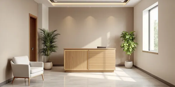
A clinic swaps collaboration for privacy. Conversations must not carry, so screening and acoustic separation do work an open office would never ask of them, and the waiting area has to feel calm rather than impressive because the people sitting in it are anxious. Air handling carries a clinical requirement on top of comfort. Staff still spend a full day there, and a reception counter worked all day needs the same thought a desk does, which is a good part of what separates a clinic or wellness interior from an office.
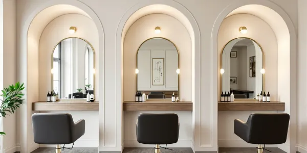
A salon stylist stands at the same chair for hours while the client sits in it. The mirror light has to serve both, honest enough to work by and kind enough that the client likes what they see, which is a harder brief than it sounds. Ventilation here has to handle chemical load as well as heat. And the wall the client faces for an hour is where the design weight belongs. The entrance gets looked at once.
A workspace shows all four questions at once, which is why it is the clearest place to see them. Desks, breakout, meeting rooms and services all have to coexist on one floor plate, and the five zones of a working floor is the most useful way to plan that.
As for budget, commercial costs vary widely with the extent of services work, the joinery specification and the condition of the shell at handover, and any honest figure only arrives once the plan and the material set are settled.
Sources & References
- National Building Code of India, provisions for commercial occupancy and building services
Frequently Asked Questions
- What is the most common mistake in a commercial fit-out?
- Designing outward from the reception. The entrance takes the budget and the attention while the desks, where the hours are actually spent, get laid out to a template afterwards. Reversing that order costs nothing and changes how the space feels to work in.
- How many meeting rooms does a workplace actually need?
- Fewer large ones and more small ones than most plans allow. Watching how a business really meets usually shows most conversations involve two or three people, so several small enclosed rooms plus one genuinely large room tends to serve better than a row of identical eight-seaters.
- Does an exposed services ceiling make a space noisier?
- It can, because hard surfaces overhead reflect sound back down. Closing the ceiling in is the wrong fix. Absorption where it counts does the job: acoustic rafts over the densest desks, soft finishes at floor level. That keeps the height and the character while controlling the noise.
- What is worth spending on when the budget is tight?
- The things that cannot be added later. Air handling, the position of power and data, acoustic separation and the daylight relationship at the desks are all expensive to retrofit. Finishes, furniture and decoration can improve over time without undoing work.